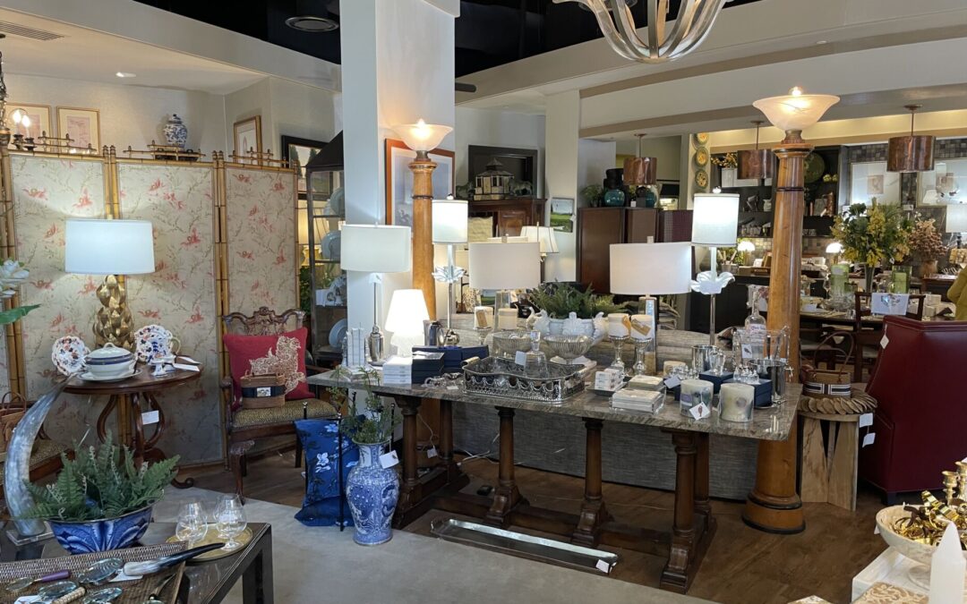
Decorating with prints and patterns can bring life, color, and personality to any space. When done right, they create a dynamic and stylish look that transforms a room. But, it’s easy to go wrong with these design elements, resulting in a space that feels more chaotic than chic. Here are 10 common mistakes people make when using prints and patterns in their décor, and tips to avoid these pitfalls for a balanced and beautiful look.
1. Mixing Too Many Patterns at Once
Cringe Factor: Mixing multiple bold patterns without a plan can make a room feel visually overwhelming and disorganized. It’s like a clash of prints that compete for attention, leaving your eyes nowhere to rest.
Solution: Stick to 2-3 patterns with similar color schemes to create harmony. For example, pair a floral pattern with a subtle stripe or geometric print in complementary hues. This adds interest without making the space feel chaotic.
2. Ignoring the Scale of Patterns
Cringe Factor: Using patterns of the same size throughout a space can make everything feel busy or flat. When patterns are too large, they can overpower a small room; too small, and they might get lost in a larger space.
Solution: Mix different scales—pair a large, bold print with a smaller, more delicate one. This variation adds depth and dimension to your décor, creating a balanced and visually appealing space.
3. Forgetting About Neutral Spaces
Cringe Factor: Using prints and patterns everywhere, from walls to furniture to accents, can make a room feel like it’s trying too hard to be stylish. Without any neutral space, it becomes sensory overload.
Solution: Give your eyes a break! Balance bold patterns with solid colors and neutral areas. Think of solid-colored walls or plain furniture as a canvas that allows your prints to shine without competing.
4. Not Matching Colors Properly
Cringe Factor: Patterns that clash in color can make your space feel jarring and disjointed. Using random colors that don’t complement each other creates a room that lacks flow.
Solution: Choose patterns that share common colors or fit within the same color family. A good rule of thumb is to pick a dominant color and weave it through various patterns, making sure the tones work well together.
5. Using the Same Pattern Too Much
Cringe Factor: Repeating the same pattern throughout a room—from curtains to throw pillows to rugs—can look too matchy-matchy, making the room feel flat and uninspired.
Solution: Break up the repetition by introducing coordinating patterns. If you have a floral print on your curtains, try a striped or solid pillow with a hint of that same floral hue for a cohesive but varied look.
6. Going Too Bold in Small Spaces
Cringe Factor: Covering all walls of a small room with a bold pattern can make the space feel claustrophobic and much smaller than it actually is.
Solution: Use bold patterns as accents rather than full-room treatments in smaller spaces. A feature wall, patterned area rug, or a set of printed throw pillows can add flair without overwhelming the room
7. Overlooking the Power of Texture
Cringe Factor: Using flat prints without considering textures can make a room feel one-dimensional. Prints alone don’t add the depth that texture can provide.
Solution: Combine textured fabrics like velvet, linen, or woven materials with printed elements. This blend creates a layered, rich look that feels more inviting and tactile.
8. Ignoring the Room’s Function
Cringe Factor: Choosing loud, busy patterns for rooms meant for relaxation—like bedrooms or reading nooks—can make it hard to unwind and feel comfortable.
Solution: Opt for calmer patterns in spaces where you want to relax, like soft florals or subtle geometric designs. Save the bold patterns for areas where you want to energize the space, such as dining rooms or living areas.
9. Not Testing Patterns Together
Cringe Factor: Buying different patterned pieces without testing how they look together can lead to a mismatched and clashing result. What looks good online doesn’t always translate well in real life.
Solution: Sample first! Gather swatches, fabric samples, or small pieces of your patterns and lay them out together before committing. This will help you see how the colors, scales, and designs interact in your space.
10. Neglecting Personal Style
Cringe Factor: Decorating solely based on trends without considering your personal taste can leave your space feeling impersonal and uninviting. If you don’t love the patterns you’ve chosen, it will show in the final result.
Solution: Remember that your home should reflect your style and personality. Choose patterns that resonate with you and make you feel at home. It’s okay to break a few rules if it means creating a space that feels uniquely yours!
In Conclusion: Balance Is Key
Decorating with prints and patterns can elevate any space from ordinary to extraordinary—if done right. The key is to balance bold and subtle, mix scales, and keep your personal style at the forefront of your choices. By avoiding these common mistakes, you can create a space that feels both stylish and welcoming, making every room a true reflection of you.
So, next time you reach for that bold floral wallpaper or geometric rug, keep these tips in mind and watch your space come together beautifully! Happy decorating!

